It's my view that the Kitchen is the first place you should remodel. When guests show up, for some reason we always wind up standing in the kitchen! This was a project we worked on with Steve Henderson from "Coastal Home and Garden" up in Maine.
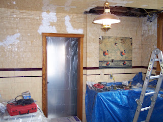
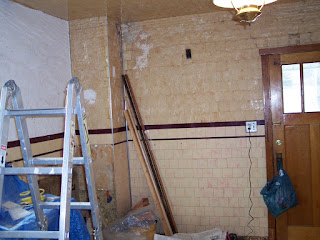
The house was built in the early 1920s and had several issues. No cabinet space, minimal counter top space, uneven walls and ceiling, one circuit and plastic tile from floor to ceiling. The odd spot on the wall was the only wall mounted cabinet in the entire kitchen.
So to start, the tile came off the ceiling, holes were patched and a plan for upper and lower cabinets along with an island was put into motion. The stove would move over one wall to allow for more uninterrupted counter space, an above the range microwave installed to move it "up" and an angled corner cabinet would be made to cover the gas furnace "chimney" vent.
The ceiling would receive furring strips to level it out and Armstrong 12-in x 12-in tin look Wellington ceiling tiles for a traditional look. So with the demolition almost finished we moved to the walls.
We decided on a "Mediterranean" style finish on the walls. This will help cover the unevenness and add a nice touch to an old house. We only removed down to the accent tile line with our plans in mind.
The corner of the ceiling was filled in nicely and the walls continued to receive their texture. There was only one ceiling light in the kitchen. The new plan was for a ceiling fan and two lights over the sink area.
We ran all the wires and installed all the boxes to save money on the electricians bill. That way they can just make all the connections!
Here's Steve working hard on the textured walls. Once the walls were completed we moved upwards.
Next came the furring strips on the ceiling. It takes time to get it all level but the finished product is worth the extra time. We spaced the strips at 12" intervals for placing our ceiling tiles.
The Armstrong ceiling tiles are tongue and groove for easy installation. They are also partially constructed of recycled materials.
Measure your room and adjust the size of your first row so you don't have a full panel on one side of the room and just a sliver on the other. We wound up cutting off approximately 3" so the sides would be even. Here you can see them going into place.
They are easy to trim, so holes for light fixtures are no problem. Now we just need to get the other half of the ceiling finished.
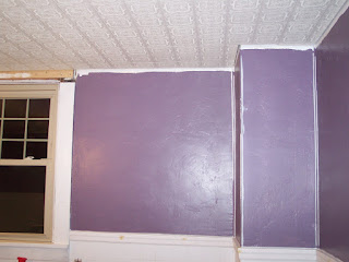
Whew, ceiling is in, now lets add some color to those walls. Chair rail moulding was installed to separate the lower tile from the textured wall.
The tile was sanded and painted a warm cream color. The wood work around the doorways and windows was painted to match.
Here you can see the traditional style ceiling light going into place.
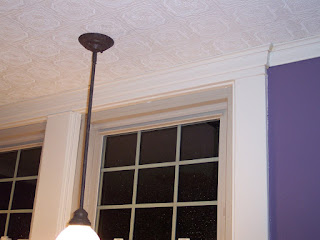
The board above the window needed replaced and in the process, we added a bit of flair to it. Here's one of the lights above the sink area and the connecting crown moulding along the wall on the right.
Here's a view of the crown with accent pieces on the interior corners.
Here you can see the back door and trim painted, new outlet and light switch, new ceiling and crown moulding.
Now that's a good start to a nice looking kitchen if I do say so. Next post we'll add the cabinets and flooring.
Enjoy!


No comments:
Post a Comment