Friday, December 21, 2012
Deck the halls with glossy paintwork!
Finished decking the halls in a very nice home nearby. The owner asked for an all glossy paint project, with a brush. There's something wonderful about having a brush in your hand.
This is the one end of the hall with two bedroom doors, four closet doors and all the trim.
Here at the other end there are actually 2 more bedroom doors, the thin closet door and associated trim. The closet door is painted and you can see the original color on the far bedroom door.
Everything has been painted with two coats of Dover White High Gloss paint from Sherwin Williams.
Enjoy
Friday, December 7, 2012
Set Design and Stage Construction
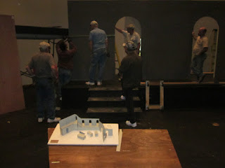
These shots are the model we built a few months back. It will be the Inn where Mary and Joseph come to try and get a room. The right side of the stage will "fold" in, revealing the stable outside the Inn.
Our idea was to cover the set in "stone" made from sheets of polystyrene insulation. We had lots of work to do, and only a couple weeks to do it so in conjunction with Barzan Productions we had at it.
Working space was always at a premium! The blocks were cut and then the edges would be shaved down and cracks carved into the foam blocks. You can see test stones on the left.
We had lots of volunteers helping to paint...
and to cut. We used thicknesses from a half inch to two inches. This would allow the stones some depth when applied to the stage set.
We tried a number of cutting tools to get different textured edges. To give the surface texture for painting, Barzan Productions developed "The Texturizer".
It was an old paint roller with gravel hot glued onto it. When rolled onto the foam, it made sweet indentations for drybrushing.
Then, "Black Friday" started with set construction! Thanks to Ghelarducci and Sons for getting the scaffolding in and helping organize the construction volunteers.
Here's the model, hard at work..
The walls going up...
Which way do the steps go?
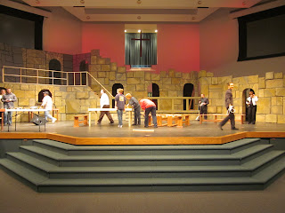
Look at the size of that thing!!! Cut the chatter red two! It's over 100 feet across and 16 feet high. We need lots of stone to cover all that surface!
Once the stones were textured and had a base coat on them, the painting continued with our midtones and highlights.
As painting continued, we tried a few patterns up on the set...
The first arch was pieced together from individual stones and then realizing we had to do 10 arches we needed another plan.
We decided to carve them out of a single piece of foam. This made construction much easier and quicker.
With stone running low and more surface to go we improvised. On the upper level we had two fake doorways so we cut the opening from a full sheet and planned to carve full sheets on the entire upper area.
Here is one of the carved panels. A piece was attached to add extra dimension, matching the rest of the set.
We painted the gaps with a dark gray for additional contrast on the upper level.
Here are the doorways on the right side before painting. Occasional thicker stones, seen in green, were added to vary the thickness.
The upper level panels going in slowly but the adjoining stone going from level to level came together nicely. All the pink foam was getting covered in the base gray paint too.
Our "wood" railing being added. Yes these were also carved from the foam insulation boards.
Working out the details on the hinged side of the set. Stones that cut across the joint will be seamed with gaffers tape and painted to match the stone. This will allow them to flex across the hinge and cover it too.
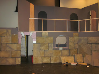
Here we see the lower levels almost complete, except for the stable.
One of our lovely assistants drybrushing stones
The various thicknesses allow great shadows!
Here you can see how the texture looks when the drybrushing is completed
Now we've got a good looking wall!
Some stone work needed touched up and the right side needed a few remaining block...
There they are, that's better!
The redwood was cut from a fence railing and stained. Pegs were added to hand sacks and other stage dressings. We did not want an arch in the stable, but a framed door, so part was cut away.
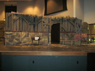
The wall was painted with dark gray and brown to simulate wood boards and the carved timbers were added. Straw covered the top and a few additional details added
Without the flash and better stage lighting, the timbers stand out quite well.
Here is the stable in the closed position...
opening...
and opened. Ooops, need to touch up the backs of the stone sticking up on the other side!
Other wise we think it looks pretty darn nice.
Here's a few last images. with most of the stage dressing completed. Thanks to the many volunteers from South Hills Assembly who provided an untold amount of man hours in base painting and stage construction! Well done.
With over 250 individually cut stone and another 200 cut into full or partial panels, it came to completion rather well.
The show is Dec 7th, 8th and 9th at 7:00 pm. Stop in and see it live!!
Enjoy
Wednesday, December 5, 2012
Floral Logo Design for Local Ministry Center
A locally based ministry we support was in need of a logo design for a new program. The Abundant Life Ministry Center has programs with a worldwide reach. From counseling women in difficult situations to rescuing girls in the slums of India.
When they needed a logo to help promote their new weekly event called "Women of Excellence". We stepped up to the plate and gave it a swing. Here you see the finished log, but how did we get there? Let's take a look....
The first round of ideas was presented in three different directions.
The first a light contemporary,
the second classical and elegant and
the third was a more natural approach.
After some conversations, we proceeded to round two. The contemporary was liked but not the font and they wanted some color. So we switched to Vivaldi for the font and swapped the black and white image for a color one.
The classical version wasn't out yet but they didn't want it to look so "Old Fashioned". We went with two variations of color with corresponding floral elements. A simpler version of each was shown for use on letterhead or other limited color printing.
The contemporary won out! We were now very close to finished. All that remained was to lighten the floral element slightly. Here is the floral layer lightened and shown on a dark background to see the element breaking the boundry
We had to edit the font to change the capital "E". We removed the swirl that continued into the middle of the letter. An outer glow was added for logo readability when over the floral element.
Combing the layers together, we had the final floral logo with type. All the work was done with Adobe Photoshop.
A fun successful project! You can visit the Abundant Life Ministry Center site for any information on their ministries.
Enjoy
Subscribe to:
Comments (Atom)


